
Times are changing, and sending your subscribers a basic HTML email is no longer the best way to reach them. Back when most people were viewing your emails on a desktop computer, HTML was the way to go. But now, with more and more emails being opened on a mobile device instead, sending mobile-compatible email has become mission critical in order to stay relevant to your subscribers, drive click-throughs, and get sales.
Below we offer a quick overview of your three choices for email design, and the advantages of each.
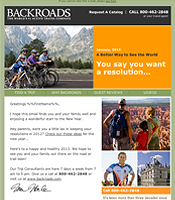 Traditional email design
This is now old school, meaning the right way to do things before mobile went mainstream. The traditional desktop view presents your HTML email in full width. Your average HTML email is typically 600 pixels wide, and looks good on a properly sized monitor. All images are sized correctly, the call-to-action and a majority of the content is easily seen.
However, this is not how all of your subscribers view your email because not all of your subscribers will be sitting at a desk when your email gets to the inbox.
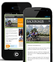 Mobile email design
Making email mobile is not something that happens automatically as this example shows. Viewing the same email on a mobile device gives you a much different experience: Either the entire email shrinks–rendering it nearly impossible to read without having to zoom–or worse, only the top-left corner of the email can be seen, making for a sloppy navigation experience.
Worst of all? Your call-to-action is nowhere to be found.
 Responsive email design
Now, here’s where the magic happens and email design gets with the program. With an email coded for responsive design, text is enlarged for easier reading, the images are adjusted according to the dimensions of the email client, and your call-to-action is front and center; providing device specific content rendering. Responsive email design isn’t static. Rather it responds to the device it’s viewed on.
If you need any help rethinking or even reconfiguring your own email design to ensure it stays relevant to your audience, call on the email technology experts at ClickMail. We are here to help!
About the Author: Sharon

